
This is my second post today. For my Muse News, please scroll down to the next post.
Suzanne had the funniest idea for April Fool's Day - post your ugliest card ever. Everyone has one!

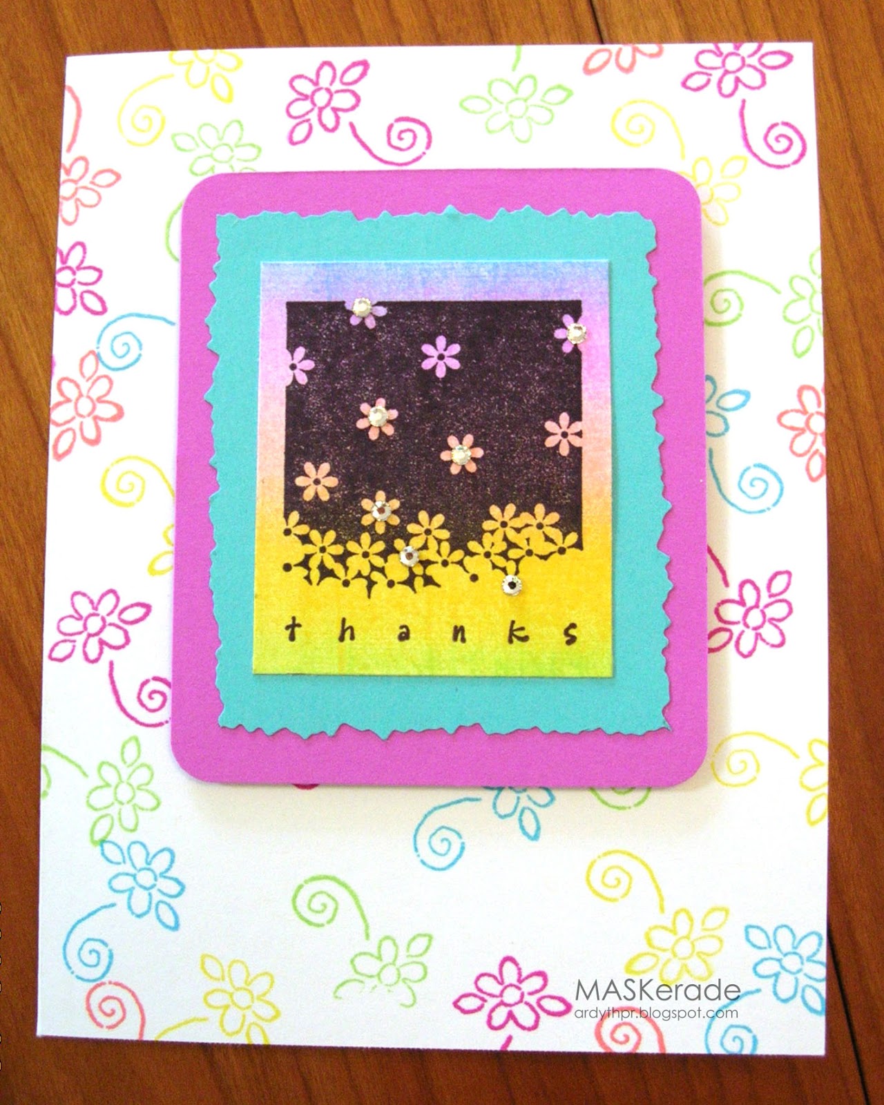
Interesting to note that some of the components here are still favourites of mine - some white space, bright colours, dramatic use of black, bling and kaleidecolor. But somehow they didn't go together very well. Add in some deckled edges and rounded corners (back then, I just threw everything in!) and voila, my ugliest card ever. It was even uglier before I lightened it in Photoshop (but I promise that's all I did - just so you could get a clear view!)
I hope you're brave enough to play along - it's good to laugh at ourselves from time to time. It keeps us humble and it can even be fun!
I have been having a good laugh on this hop because I IDENTIFY so much with all the issues these cards have! It is like a trip down memory lane! Love it!
ReplyDeleteO.K. while I don't think this card is ugly, it isn't your usual graphic modern style. LOVE the bright colors, it's a very HAPPY card!!!
ReplyDeleteIt does have great colors! And the little flowers are cute, and I like the "thanks". Just not all in this one card perhaps... ; )Wait till you see mine... This is fun. Bev
ReplyDeleteArdyth your card is definitely not ugly, but certainly not your usual clean and modern style! So much fun, Happy April Fools.
ReplyDeleteThanks for being brave and playing, Ardy! It is a tribute to us that we can look back and laugh and appreciate how much better we are at card making. Just like everything, practice makes (in your case) perfect!!
ReplyDeleteThis card doesn't qualify as being ugly. It is very sweet and lovely! And yes, it's not your usual awesome style and cool design, but it is still not ugly !! Thanks for the share and smile!
ReplyDeleteI made cards for 2 yrs before I began blogging, so my disasters have mostly hit the skids through the years, but trust me - I was able to find one horrible creation to share :)
ReplyDeleteThis is really kind of cute with those pretty spring colors, but those decorative edge scissors were a horrible investment weren't they? My grandchildren have all of mine :)
This blog hop has been so much fun. As you pointed out this card does have the components you like so much and yet... good to know we all have these cards in our closets! Too much fun. Please feel free to come look at my ugly!
ReplyDeleteI agree with what some of the others before me have said, I don't think this card qualifies as "ugly" I think it's cute and creative...
ReplyDeleteOk not that bad at all! Its more on the pretty side. But you have come a long way! This sure has been fun!
ReplyDeleteNow if you just post that little middle piece on a white base, I think it would turn out pretty awesome! The deckled edges...were they made with the scissors? I have to say I have Deckled Edge Nesties now and like them very much. But achieving the look with those blasted scissors was near impossible back in the day ;)!
ReplyDeleteTotally fun!! Actually your colors are wonderful...my ugliest failed at even that!!
ReplyDeleteOh, this makes me laugh. It is not as ugly as mine, but it clearly is not up to your current standards. It gives me hope--that I can evolve.
ReplyDeleteI am having so much fun with this hop. I can totally identify with everyone's posts. You did a good job with the colors on the card.
ReplyDeleteHmmm, it's not exactly ugly, but it's not quite "right". Definitely not your signature style!
ReplyDeletegiggle...well, it does showcase several techniques...all in one card!
ReplyDeleteGotta say though, that I really like the background!
Too funny! Good thing that through trial, error, trend and changing styles, we all find our "style" and place. :) I do so LOVE your current cards.
ReplyDeleteHi Ardyth! I don't think this is that bad, and I love that stamp. I think I have it upstairs somewhere in my stash!
ReplyDeleteLove how you pointed out how elements in this card are still true to your style.
Thanks for joining the hop!!! xoxo
Thanks for the great laugh today. And no, I'm not laughing at your card. I just got such a kick out of your comments about it. I wouldn't even call it "ugly"... just not the style of card I'm used to seeing you make. Now I think I have to look at the rest of the hop just out of curiosity! LOL! Thank goodness I don't even have a picture of my ugliest card! :)
ReplyDeleteTee hee ... ok, not the Ardyth-esque style we're used to seeing but not ugly! Thanks for showing us your starting point ... interesting how your key components of vibrant colours, bling and black have been constant! Anita :)
ReplyDeleteEven on your "worst" card ... take the kaleidecolor panel out, mount it on your square white base with a black edge, and ta-da ... current day Ardyth! Well, you'd still have to throw in a twist of some sort, but definitely in the ballpark. Love seeing an Ardyth card that is not in the current Ardyth style! Super fun post!
ReplyDeleteThat looks like one of my early cards - you give me hope!
ReplyDeleteLOL--it's not that the card is ugly, it is just so uncharacteristic of your NOW style! I do remember this stamp these ink pads and those terrible deckle scissors. I could NEVER cut straight lines with them! You are brave to share...I think I threw all my ugly ones away!
ReplyDelete